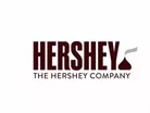
Hershey Company Fields Backlash Over New Corporate Logo

Earlier this week The Hershey Company unveiled its new corporate logo, as part of an effort to highlight its growth “from a predominately U.S. chocolate maker to a global confection and snack company,” as Ad Age reports. Designed in-house with additional help from goDutch of Cincinnati and Alexander Design Associates of New York, the new logo is streamlined and slick, featuring a no-frills font and the addition of a little silhouetted Hershey’s Kiss on the side. In the new design, The Hershey Company sees the sleek modernity of a global brand:
But not everyone is sharing Hershey’s own perception of its new branding attempt. The icon’s perception across media and consumer chatter has been, well, not quite so highbrow:

It seems safe to say that isn’t the reaction that The Hershey Company had been aiming for. What to do? At a time like this you can either backtrack or double down, and Hershey is in no mood to backtrack. So rather than send the logo back to the drawing board, it’s sticking by the creation. According to MarketWatch, the company’s spokesperson is confident that the logo will be recognized and appreciate:
This is very true – there was a lot of backlash against the naming of Mondelez International, with consumers and the media crawling out of the woordowrk to ridicule the name and compare it to George Costanza’s alter ego employer Vandelay Industries. Two years later, no one’s talking about anything except Mondelez’s success and the criticism of the name is water under the bridge. The same thing will happen with the new Hershey logo. It’s just going to have to ride out the tweets in the meantime.
[SOURCE: Ad Age; MarketWatch]
- Hershey launches its Kisses chocolate brand in India as part of $50mn investment driveFood
- Hershey first quarter sales strengthened by Amplify acquisitionFood
- Hershey to invest $60mn in Pennsylvania confectionery plant to increase Kit Kat productionFood
- Why Nutella's personalized branding strategy didn't work outRetail
Featured Articles
Fresh investment supports TRACT in enhancing tools for sustainability in the food and agricultural sectors, aligning with EU regulations
The devastating floods in Spain have shaken up the global citrus supply, heightening challenges in the fruit juice drinks market
McDonald's has spent 40 years supporting students with scholarships & plans to continue, despite Robert F. Kennedy Jr.’s plan to Make America Healthy Again

